Coloring for Beginners: How to Choose Colors That Look Beautiful Together
Learn simple color theory for coloring books, including complementary, analogous, and monochrome color schemes. Discover how to choose colors with confidence and create beautiful coloring pages without feeling overwhelmed.
4/21/20263 min read

If you’ve ever opened a coloring book and thought:
“I don’t know which colors to pick…”
“What if it looks wrong?”
You’re not alone.
Choosing colors is one of the biggest struggles for beginners — especially when working with adult coloring books, where designs can feel more detailed or artistic.
But here’s the good news:
👉 You don’t need talent to create beautiful color combinations.
You just need a few simple rules.
In this guide, you’ll learn how to use color in a way that feels easy, relaxing, and natural — whether you’re using printable pages or a physical coloring book.
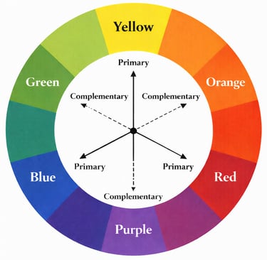
The color wheel is a simple circle that shows how colors relate to each other.
🎨 What Is a Color Wheel (and Why It Helps in Coloring Books)
You don’t need complex theory to make your coloring book pages look beautiful.
Start with these 3 easy systems:
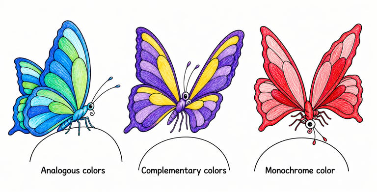
🌈 3 Simple Color Schemes for Coloring Pages
It usually includes:
Primary colors: red, blue, yellow
Secondary colors: green, orange, purple
👉 Think of it as a map.
When you’re coloring a page from your coloring book, instead of guessing, you can use the color wheel to quickly find combinations that naturally work well together.
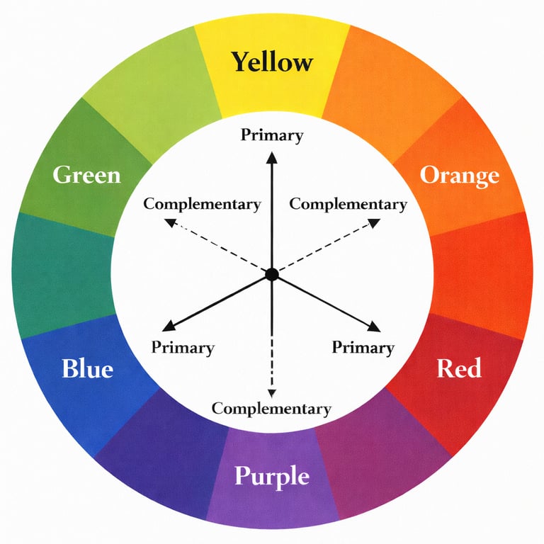
These are colors that sit opposite each other on the color wheel.
Examples:
blue + orange
red + green
purple + yellow
👉 Why it works:
strong contrast
makes your coloring page stand out
👉 Perfect for:
bold designs
coloring books with strong outlines (bold and easy style)
1. Complementary Colors (High Contrast)
These are colors that sit next to each other on the wheel.
Examples:
blue + blue-green + green
pink + red + orange
👉 Why it works:
harmonious
very relaxing to look at
👉 Perfect for:
relaxing coloring pages
floral or soft designs in coloring books
2. Analogous Colors (Soft & Calm)
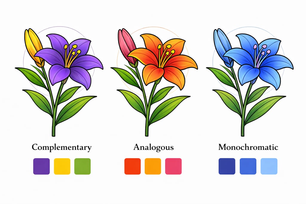
This means using one color only, but in different tones.
Example:
light blue + medium blue + dark blue
👉 Why it works:
very easy
always looks clean and elegant
👉 Perfect for:
beginners
simple coloring pages in adult coloring books
when you want a minimal look
3. Monochrome (One Color, Many Shades)
When coloring in a coloring book, it’s tempting to use many colors.
But here’s a simple rule:
👉 Stick to 2–4 main colors per page
Then repeat them across the design.
This helps your coloring page look:
balanced
calm
more professional
Even very simple coloring book pages can look beautiful with just a few colors.
✨ The Golden Rule: Use Only 2–4 Colors
Use complementary colors (purple + yellow)
🖌 How to Apply This in a Coloring Book
Let’s make it practical.
Imagine one page from your coloring book — you can color it in completely different ways:
Option 1: Calm Look
Use analogous colors (blue + green tones)
Option 2: Bold Look
Use monochrome (one color only)
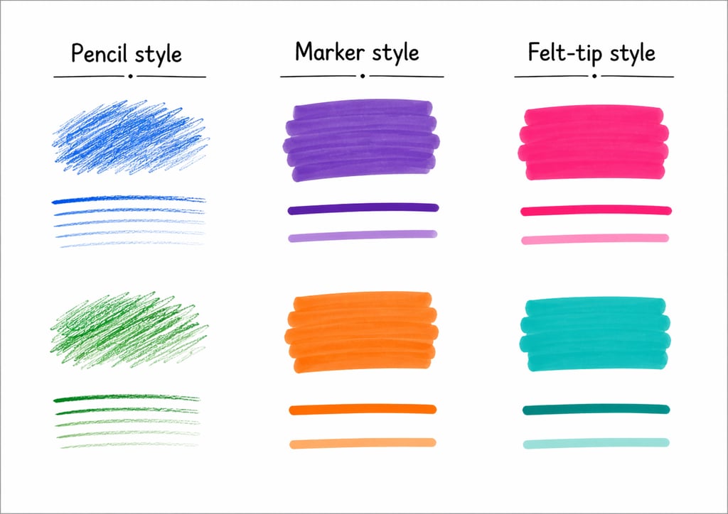
🧰 What Tools Work Best for Coloring Books?
Option 3: Minimal Look
✏️ Colored Pencils
soft and easy to control
ideal for beginners
allow gentle shading
👉 Best for:
detailed adult coloring books
calm, relaxing coloring
🖊 Markers
bold and vibrant
quick to use
strong color effect
👉 Best for:
bold and easy coloring books
large shapes and clean designs
🖍 Felt-tip Pens
simple and clean
easy to handle
👉 Best for:
beginners
simple coloring book designs
Your tools will change how your coloring book pages look and feel.
Many beginners feel pressure when opening a new coloring book.
But you don’t need to:
use many colors
follow strict rules
make it perfect
👉 Simple coloring often looks better.
Especially in:
minimal designs
bold and easy coloring pages
beginner-friendly coloring books

👉 Same coloring book page — completely different mood.
🌿 Keep It Simple (Especially in Coloring Books)
Try this simple exercise with any coloring book page:
Choose one design
Pick only 3 colors
Use them across the whole page
That’s it.
This is one of the easiest ways to improve your coloring skills.
💡 A Beginner-Friendly Way to Practice
The most important rule when using any coloring book:
👉 There are no mistakes.
Some color combinations may surprise you.
Some may not work — and that’s okay.
Every page helps you learn and feel more confident.
🌸 Don’t Be Afraid to Experiment
Final Thought
Coloring is not about perfection.
It’s about:
relaxing
enjoying the moment
expressing yourself in a simple way
Whether you’re using a detailed adult coloring book or a simple bold and easy design —
you can create something beautiful.
Start small. Keep it simple.
And enjoy the process.